


UX Design Case Study
Understanding the Travel Needs of
Neurodivergent Millennials
Human Centered, Inclusive & Accessible
ZenRoute is a travel booking web application created to support neurodivergent millennial travelers by minimizing stress, cognitive overload, and decision fatigue. Unlike traditional travel apps that emphasize speed and pricing, ZenRoute focuses on calm, clarity, and a sense of control, empowering users to plan travel with greater confidence and ease.


Problem Statement
Despite increasing attention to accessibility, most digital travel platforms still fail to support the unique needs of neurodivergent millennials, particularly around planning, budgeting, and managing sensory-friendly, low-stress experiences. Traditional travel and finance tools assume neurotypical behavior and overlook challenges like executive dysfunction, information overload, and sensory sensitivities. There is a clear opportunity to design a user-centered solution that offers financial flexibility and cognitively accessible travel planning, empowering neurodivergent millennials to travel with greater confidence and comfort.
Journey
Years of firsthand experience in the travel industry, brought awareness to continuous accessibility gaps for neurodivergent millennial travelers.

lack of personalized options
Clear, personalized options will help users quickly identify choices that match their needs without forcing them to sift through overwhelming or irrelevant information. For example, an inclusive travel platform could offer filters and recommendations based on preferences such as quiet environments, flexible cancellation policies, budget limits, or accessibility features.

limited budget tracking
Improved budget tracking allows users to understand and manage travel costs in real time, helping them make informed decisions without stress or uncertainty. This would include visual breakdowns of costs, alerts when nearing a budget limit, and simple summaries of what is refundable or covered by credit card benefits can further support clarity.

absence of neurodivergent compliant resorts
Neurodivergent-compliant resorts are accommodations designed to support sensory comfort, predictability, and emotional well-being for guests with diverse cognitive and sensory needs. These resorts may offer quiet zones, low-sensory rooms with adjustable lighting, minimal noise, flexible check-in and dining times, and staff trained in neurodiversity awareness.
Design Process
My Approach
A human-centered design process follows five iterative phases, Empathize, Define, Ideate, Prototype, and Test. Below is a polished narrative detailing how I approached each phase in this project.

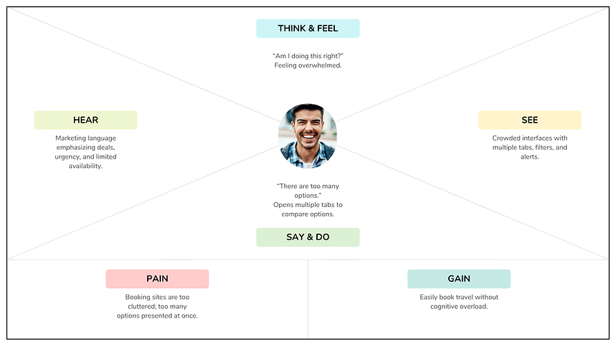
Empathy Map
User Personas

"I need reassurance, not more choices!"
"This shouldn't feel this stressful!"

Research Methods
The goal was to understand how neurodivergent Millennials experience current travel booking platforms specifically where confusion, overload, and frustration occur. Mostly during planning, budgeting, and booking.
User Surveys
35 Participants
Affinity Mapping
Identified patterns across surveys
Heuristic Analysis
Visibility of system status
User Interviews
"This should feel this stressful!"
Competitive Analysis
Too much cognitive overload
User Testing
5 Participants
Survey & Research
Qualitative Analysis
I designed and distributed an online survey to better understand how users—particularly neurodivergent Millennials—plan, budget, and book travel. The survey used clear, structured, and accessible language to minimize cognitive load and avoid leading questions. Participants were given the option to skip questions or provide open-ended responses, allowing for flexibility and comfort. Questions focused on booking habits, pain points with existing travel platforms, sensory overwhelm, navigation clarity, and confidence during decision-making.
-
35 Participants throughout the United States that identifies as neurodivergent, millennial, and has a credit card membership.
-
14 questions were ask during this Survey.
-
94% of participants agreed that travel/rewards points influences their decision to use their credit card for travel. 44% agreed their decision is based on the level of fraud protection and 35% budget tracking.
-
70% of participants a visual budget breakdown (pie chart, categories) is their most helpful feature when planning and managing travel.
-
76% ADHD, 71% Anxiety and mood disorders, 38% Autism, 24% Sensory processing sensitivity.
-
Top destination preferences are Nature/Outdoor, Beach Resort, and Cultural or Historical Location.
-
Participants agreed that they'd like see visual trip overview and timelines, reminders and checklists, and step-by-step planning guidance.
Quotes
Participants were allowed a section in the survey to disclose their pain points. Here is what some of them had to say:
"The hotel that I had booked was in a neighborhood I was not expecting, and the quality of the hotel was significantly less than I had expected."
"Any time I travel I have a very hard time, becoming very overwhelmed with comparing prices and options for just about anything, including hotels and entertainment and travel arrangements."
"My app kept defaulting back to original settings, and it didn't save anything I had changed"
Heuristic Analysis
American Express Website

Competitive Analysis Summary
The competitive analysis revealed that mainstream travel platforms like American Express Travel, Expedia, and Booking.com prioritize efficiency and feature breadth but often create cognitive overload through redundant navigation, dense layouts, and prominent non-actionable information. In contrast, AutismTravel.com demonstrates strong accessibility and reassurance for neurodivergent travelers but lacks the streamlined flows and scalability of larger platforms. Together, these findings highlight a clear opportunity to design a travel experience that combines the efficiency and trust of mainstream platforms with the clarity, guidance, and cognitive accessibility found in autism-centered solutions.

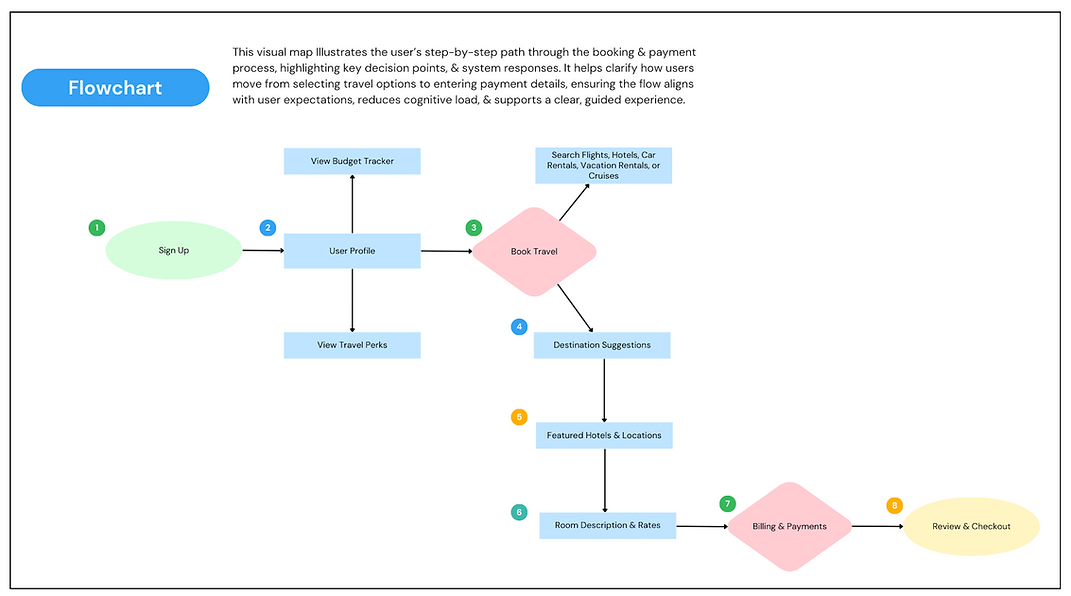
User Flow Chart
Low Fidelity Sketches


Low Fidelity Wireframes


High Fidelity Wireframes

DESIGN
PROTOTYPE


Usability & A/B Testing
Five participants independently tested the prototype in their own time. After completing the tasks, I conducted follow-up interviews to evaluate usability, identify points of friction, and gather feedback on opportunities for improvement.
I shared a second version of the prototype with the same participants, which included a brief survey designed for users who travel less frequently and needed additional support when choosing a destination, as well as additional compliance alerts for comparison.
I then conducted a second follow-up interview with participants to gather comparative insights between the two versions.
Key Findings
-
Participants responded positively to the guided, step-by-step booking flow, noting it reduced overwhelm and increased confidence.
-
Redundant navigation and repeated booking links caused momentary confusion about where to start.
-
Prominent alerts and informational messages were often interpreted as errors or warnings, creating unnecessary anxiety.
-
Users wanted clear confirmation and reassurance before completing payment.
-
Simplified layouts and consistent visual hierarchy made the experience feel calmer and easier to navigate.
-
Less frequent travelers benefited from added destination guidance, reporting increased confidence when choosing a destination.
-
Additional compliance alerts increased cognitive load and were often perceived as unnecessary or distracting.
-
Guidance was most effective when tailored and optional, rather than persistent.
Design Changes Made
-
Kept destination guidance for users who travel less frequently, presenting it as optional and contextual rather than mandatory.
-
Reduced the number of compliance alerts, removing those that were repetitive or non-actionable.
-
Repositioned necessary alerts to appear later in the flow or as subtle inline text instead of prominent messages.
-
Simplified the booking and results screens to minimize visual noise and reduce cognitive load.
-
Strengthened confirmation cues during checkout to increase user confidence before payment.
What's Next ?
-
Further develop the chatbot assistant Zena, adding more value to users.
-
Incorporate "AI - Guided Destinations." With this feature AI could analyze user preferences, past travel behavior, budget, and sensory needs to suggest destinations that align mostly with them.
-
Test with a larger and more diverse group of neurodivergent users with varying travel experience levels to further validate adaptability.
